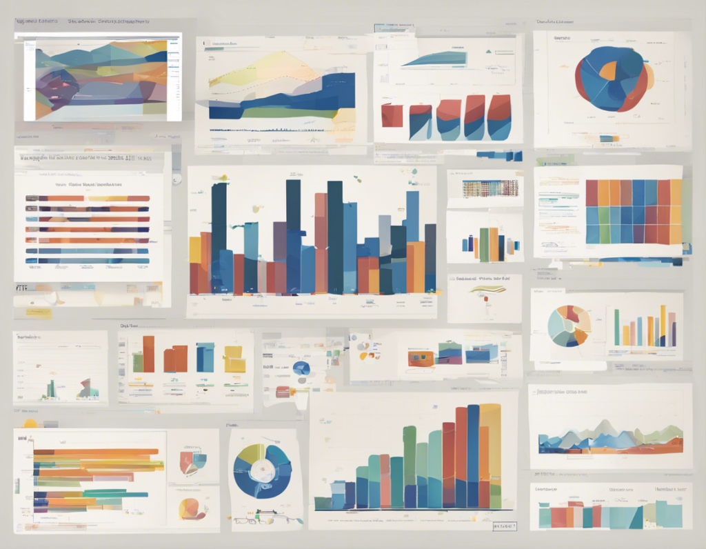
It is a common saying that a picture is worth a thousand words, and in the world of data visualization, this holds especially true. When presenting data, whether it be in a business meeting, a research paper, or a presentation, the way in which the information is displayed can make a significant difference in how easily it is understood and retained by the audience. Data visualization is the graphical representation of data and information, and when done correctly, it can simplify complex ideas and make patterns and insights more apparent.
The Importance of Data Visualization
Data visualization serves several important purposes when it comes to presenting complex information. Some of the key reasons why it is crucial to present data in a visual format include:
-
Simplifying Complex Information: By presenting data visually, it is much easier for the human brain to process and understand large amounts of information quickly.
-
Identifying Trends and Patterns: Visual representations of data can help in identifying trends, correlations, and patterns that may not be as easily recognizable in raw data.
-
Making Data Understandable to a Wider Audience: Not everyone is comfortable with tables of numbers or complex statistical analysis. Data visualization can make information more accessible to a broader audience.
-
Facilitating Decision-Making: Clear and concise data visualizations can help decision-makers quickly grasp the key takeaways from the data and make informed decisions based on the insights presented.
-
Engaging and Captivating Audiences: Well-designed visualizations are not only informative but also engaging, capturing the audience’s attention and keeping them interested in the topic being presented.
Best Practices for Simplifying Data Visualization
When it comes to presenting data effectively, simplicity is key. Here are some best practices to keep in mind when simplifying data visualization:
1. Identify Your Audience and Purpose
Before creating any data visualization, it is essential to understand who your audience is and what message you want to convey. Tailor your visualizations to suit the knowledge and preferences of your audience.
2. Choose the Right Type of Visualization
Different types of data require different types of visualizations. Whether it’s a bar graph, pie chart, line graph, or scatter plot, choose the visualization that best represents the data you are presenting.
3. Limit the Use of Colors and Fonts
Too many colors and fonts can make a visualization cluttered and challenging to read. Stick to a limited color palette and use consistent fonts to maintain a clean and professional look.
4. Simplify Your Message
Avoid including unnecessary information in your visualizations. Focus on the key insights you want to communicate and eliminate any distractions that do not add value to the presentation.
5. Use Conventional Design Conventions
Stick to conventional design conventions to ensure that your audience can easily interpret the visualizations. For example, use horizontal bar graphs for comparing data and line graphs to show trends over time.
6. Provide Context and Explanations
While the goal is to simplify the data, providing context and explanations for the visualizations is important. Include titles, labels, and legends to help the audience understand what they are looking at.
7. Test and Iterate
Don’t be afraid to test different visualizations with your audience and gather feedback to see what works best. Iterate on your designs based on the feedback received to improve the clarity and effectiveness of your data visualizations.
Frequently Asked Questions (FAQs) on Simplifying Data Visualization
1. What are the common mistakes to avoid when creating data visualizations?
Common mistakes to avoid when creating data visualizations include using too many colors, overcrowding the visual with unnecessary information, not providing clear labels, and choosing the wrong type of visualization for the data.
2. How can I ensure that my data visualizations are accessible to all audiences?
To ensure that your data visualizations are accessible to all audiences, use color-blind friendly palettes, provide alternative text descriptions for images, and design visualizations that are easy to interpret for individuals with varying levels of data literacy.
3. Are there any online tools available to help create effective data visualizations?
Yes, there are several online tools available to help create data visualizations, such as Tableau, Microsoft Power BI, Google Data Studio, and Infogram. These tools offer a range of features to simplify the process of creating engaging visualizations.
4. How can I make my data visualizations more engaging and interactive?
To make your data visualizations more engaging and interactive, consider adding interactive elements such as filters, tooltips, and drill-down capabilities. These features allow users to explore the data further and engage with the visualizations on a deeper level.
5. What are some best practices for presenting data visualizations in a presentation or report?
When presenting data visualizations in a presentation or report, be sure to provide clear explanations of the visualizations, highlight key insights, and use visuals to support your narrative rather than overwhelm it. Practice your presentation to ensure a smooth delivery and engage your audience effectively.
In conclusion, simplifying data visualization is essential for effectively communicating complex information in a clear and concise manner. By following best practices, such as identifying your audience, choosing the right type of visualization, and providing context and explanations, you can create visualizations that engage and inform your audience. Remember to keep it simple, focus on the key insights, and iterate on your designs to continuously improve the clarity and impact of your data visualizations.